
Services · Custom Corporate Identity Design
A brand identity you can explain
A logo that looks the same on a sign along the field, on a jersey, and on your website. Below you can see what we created; on the methodology page, you can read why we designed it this way.
You’ll see the research first, and only then will you receive a proposal.
From Real Life · The Magic Bees

Designed for a three-meter billboard, a T-shirt, and a pennant. Legible on all three—and that was verified in advance rather than just hoped for.
Real-world examples
This is what a corporate identity looks like when it’s finished
Not mood boards, but real things: a sign along the field, a mat, a pennant, the first screen of a website. Click on an image to see the story behind it.

The Magic Bees · MHC Weesp
Mascot for a new hockey team: the same one on the jersey, the sign, and the pennant.
The Magic Bees · MHC Weesp
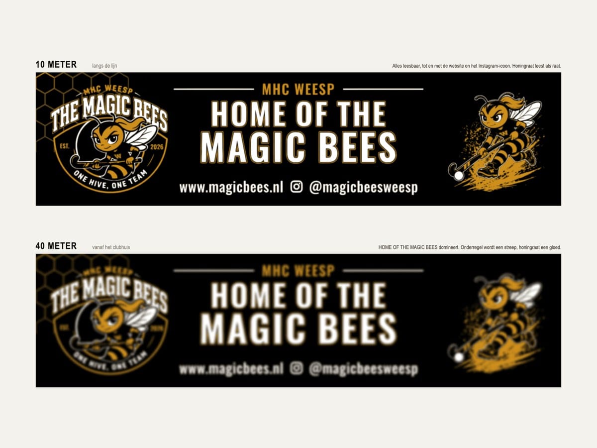
Advertising sign measuring 2.95 by 0.75 meters, tested in advance for readability at 10, 20, 40, and 80 meters.
The Magic Bees · MHC Weesp
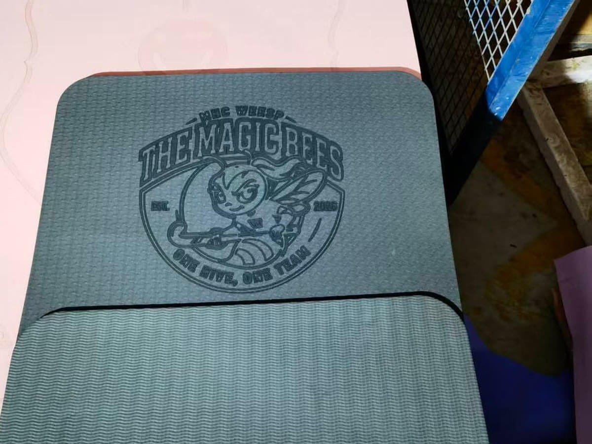
The same logo, embossed on one of the club’s sports mats.

The Magic Bees · MHC Weesp
Club pennant featuring the logo, tagline, and Instagram handle, in the same two colors as the sign.
Layoff Specialist
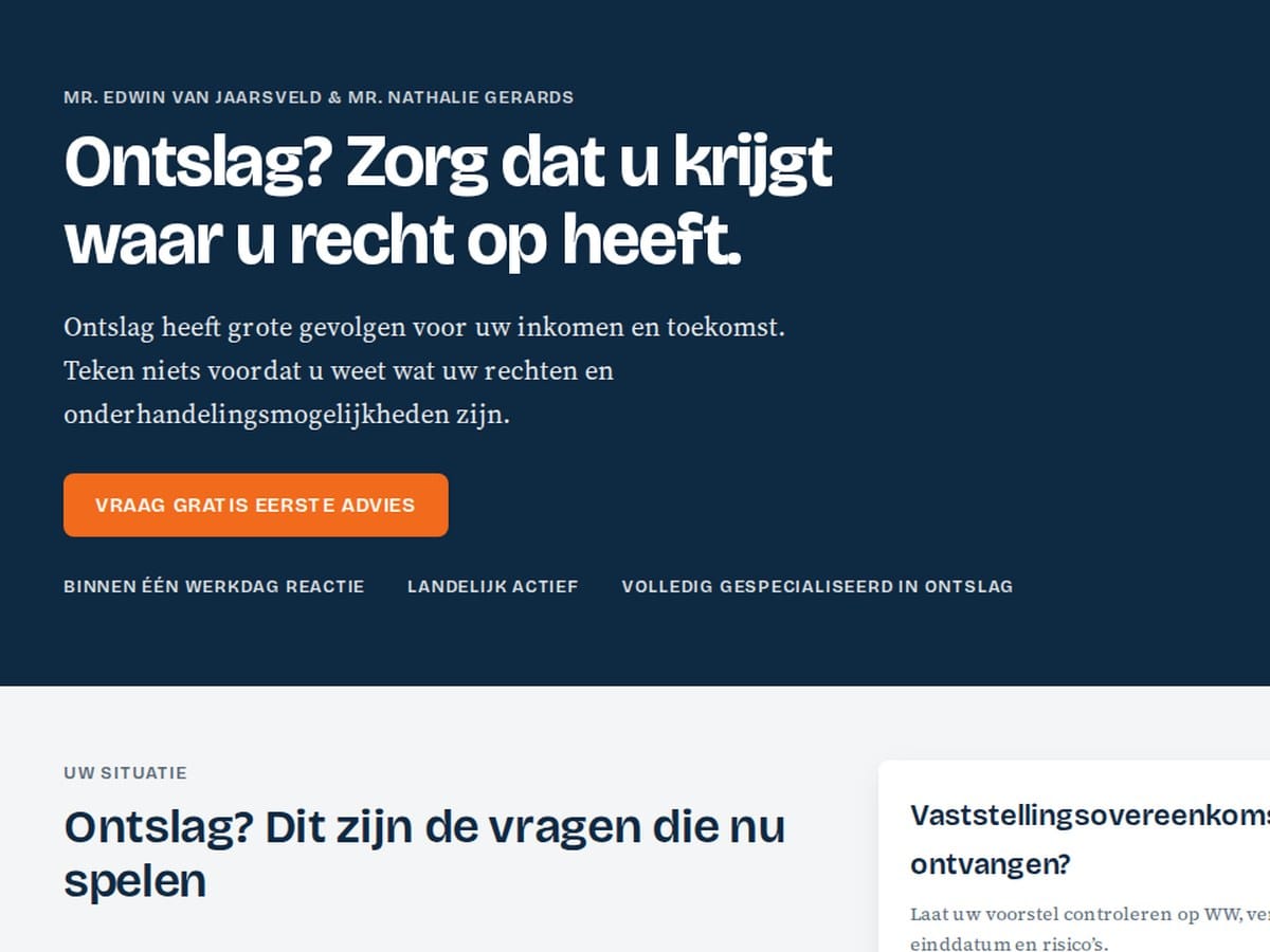
New brand identity for an employment law firm: dark blue, one accent colorAccent Color The striking color in a brand identity that draws attention, for example for buttons., a serif fontSerif Font A typeface featuring small decorative strokes at the ends of the letters, commonly seen in many newspapers. for the body textBody font The font used for standard body text.. Here on the first screen of the new site, currently under construction.

EQwise · this site
Our own brand identity: two typeface families, one brand blue, and a balanced contrastContrast How much a color differs from the background, and therefore how well something can be read., as applied to the site you’re currently viewing.
Where It Goes Wrong
Why Corporate Identity Often Falls Apart in Practice
A corporate identity almost always starts off well. There’s a logo, a color, and a font, and then the organization begins using them. A quoteCiting An AI assistant that uses your page as a source and typically includes a link to it., an ad, a new webpage: every application requires a decision that isn’t covered by the corporate identity guidelines. That decision is then made on the spot by whoever is working on it at the time.
After a few years, you’ll recognize this by three things.
- No one can explain anymore why a color is that color. As a result, every discussion focuses on taste rather than on the purpose of the color.
- The website, the printed materials, and the presentation look like they came from three different companies, because they were designed by three different parties, each of which brought their own assumptions to the table.
- There is no standard against which to measure it. Therefore, any deviation is justifiable, and the gap grows every year.
That’s not a matter of taste, but a systemic issue. That’s why, for us, a brand identity starts with research and ends with a set of guidelines you can refer to.
The Approach
What We Research Before We Design Anything
Four consecutive studies. Each one yields findings that form the basis for the next step. We also document what is ruled out, along with the reason, so that a decision made later is not called into question again.
01
Target Audience and Decision-Making Behavior
Who is looking, what question do they have, and what does that person need to see in order to take the next step? We work with personasPersona A detailed description of a typical customer, including their needs, questions, and concerns., including the doubts that cause someone to drop out.
02
Desired brand perception
What impressionImpressions The number of times your site was displayed in search results. should the brand make on each of these personas: how much authorityAuthority How much trust search engines and AI have in your website., how much approachability, how much distinctiveness? This is the yardstick against which everything is subsequently measured.
03
Color and TypographyTypography The selection and formatting of letters: which typeface, what size, and how much spacing.
We compare multiple approaches side by side and evaluate them against that standard. Contrast is measured, not estimated. Any options that are eliminated are eliminated based on sound reasoning.
04
Application and Assessment
A design direction that works on a mood board might fall flat on a form. We test it on actual screens—such as buttons, tables, and error messages—before finalizing anything.
The Evidence
Here’s a closer look at that research
We’ve fully documented one process: from personas to desired brand perception, from brand perception to color and typography guidelines. And from there to a system that’s live on an actual website. Including the guidelines that didn’t make the cut.
- From persona to brand perception, in a matrix you can follow along with yourself
- Color roles and measured contrast, rather than color psychology
- Headings and body text were analyzed separately, because they serve different purposes
- The same system applied to a real website, on desktop and mobile
An in-depth page. You don’t need to fill out anything.
The Completion
What You’ll Get
Not just a mood board, but a functional system that you can share with a designer, a printer, or whoever is building your site.
- A color set in which each color has a specific function, along with its measured contrast value
- A typographic scale for headlines, body text, and interfaces, in two typeface families with fixed weights
- Rules for buttons, cards, forms, lists, and white space, including states that are often overlooked: hoverHover How a button or link appears when you hover over it with a mouse or navigate to it using a keyboard (focus)., focus, and error
- Design tokens, so that the website, presentation, and printed materials all draw from the same source
- A document that explains, for each choice, why it was made that way and what was left out
That last part is what makes all the difference when you have to defend your decision internally—or when someone else builds on it two years from now.
Will we build your website next? If so, here’s where we’ll start: the person building it will be given the guidelines upfront, rather than having to figure them out as they go. We can also do it separately. A brand identity applies just as much to your quotes, your printed materials, and a website managed by someone else.
If there’s anything there at all
Is there already a brand identity in place? If so, we’ll assess it first.
Then we’ll start by taking stock, not by rebuilding. We’ll document what’s there, where things fall apart, and what’s of value. Often, it turns out that part of it is actually fine—it’s mainly the rules surrounding it that are missing.
You will then receive a recommendation on what can stay, what needs attention, and what needs to be replaced. We will explicitly state what does not need to be done—even if the conclusion is that most of it is usable.
Questions Beforehand
Frequently Asked Questions About Having a Corporate Identity Designed
Does my website need a redesign for this?
Not necessarily. A brand identity defines how color, typographyTypography The selection and formatting of letters: which typeface, what size, and how much spacing., and space should function. Whether your current site can handle that is a separate question we investigate first. Sometimes applying the rules is enough; sometimes it isn’t. You will know the answer before anything is built.
How long does it take?
Expect four to six weeks, from the initial consultation to a finalized design systemDesign System A collection of fixed rules and components used to ensure everything is created in a consistent style.. What determines the leadLead Someone who has shown interest and left their contact details, for example via a form or a phone call. time is rarely the design: it is the two moments where you make a choice.
How much does a brand identity cost?
There are three packages, all amounts excluding VAT. Start €1,250 to €1,750 (one to two weeks), Plus €2,750 to €3,500 (two to three weeks) and custom from €5,000 (four to six weeks).
Start and Plus have a fixed scope with two rounds of revisions. For a custom brand identity, the requirements make the difference: digital only or including print, a single logo mark or a set of variants, with or without a mascot or illustration. For these projects, you will receive a fixed-price proposal following the introductory meeting.
How much of my time will this take?
We return with fully developed directions, not a questionnaire. You simply review what is already there and make a choice. What we need from you is your customer knowledge and your judgment at the moments when there is a real decision to be made.
Why don’t you choose a color that fits the industry?
Because a color carries no meaning on its own. How it is perceived depends on saturation, contrastContrast How much a color differs from the background, and therefore how well something can be read., the size of the surface, and how often it recurs. It also depends on the typographyTypography The selection and formatting of letters: which typeface, what size, and how much spacing. and the surrounding space. The same shade of blue can look professional or cheap, depending on that context. We therefore always evaluate the combination and never the color in isolation.
Hourly Rates
| Form | Rate |
|---|---|
| Drop-in, no appointment needed | €125 |
| 20-hour punch card, prepaid | €115 |
| Starting at 50 hours per year | €110 |
| Fixed-term monthly contract, starting at 8 hours per month | €100 |
We offer three corporate identity packages at fixed prices: Start (€1,250 to €1,750), Plus (€2,750 to €3,500), and Custom (starting at €5,000). The contents of each package are listed on the pricing page. We charge for additional rounds of revisions at the hourly rate listed above.
All amounts are exclusive of VAT.
The first step
First, find out what your brand needs to do
A single conversation where we’ll go over your current situation, who your customers are, and where things are falling apart. After that, you’ll know what’s needed—and whether we’re the right fit for the job.
