
Website and Online Marketing
Foldable Phone: What Changes for Your Website?
Apple also released a foldable phone in October 2026. Below, we explain what the changing screen of such a device means for your website.
Foldable Phone
The answer
In brief
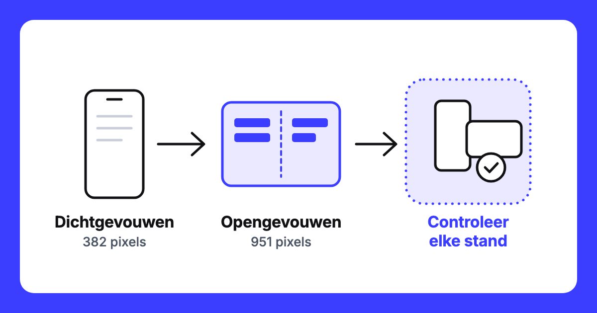
- The first block shows how wide your page can be on an iPhone Duo.
- Apple states that websites work on its foldable phone just like everywhere else.
- Whether your page looks good there, you need to check yourself.
- You can see how many of your visitors use such a device in your statistics.
Screen
What changes for your website when someone opens a foldable phone?
A foldable phone is not a third screen size alongside phone and tablet, but a single device that changes size during a visit. With Apple’s iPhone Duo, the width of your page in Safari 27.1 can range from 382 to 951 pixelsPixel A single dot on a screen or digital image.. Apple states this in the WebKit blog of 23 October 2026. By pixels, I mean the screen width as used by the browserBrowser The program you use to view websites, such as Chrome, Safari, Firefox, or Edge., not the number of physical dots on the screen. The 382 corresponds to the outer screen in portrait mode. The 951 corresponds to the inner screen in landscape mode, with one tab open. That is approximately two and a half times as wide. In between, there are three other modes, for example, two windows side by side. Folded, it’s a phone screen like any other; unfolded, your page gets much more space.
One device, five widths
Apple states in the same WebKit blog that websites and web apps on the iPhone Duo work just like everywhere else. However, this does not mean your page will look good. Check your page folded, unfolded, and in landscape mode, and do so with the device in your hand: see if menus, buttons, and text are in the correct place in every positionPosition Your position is the place your website holds in the search results for a specific keyword. Position 1 is the top organic result..
Market
How big is the market for foldable phones, and what is Apple bringing?
Worldwide, a foldable phone accounts for approximately 2% of the market, according to Counterpoint on 7 September 2026. In December 2025, IDC estimated 20.6 million foldable phones worldwide for 2025. Apple released the iPhone Duo in October 2026. Counterpoint predicted in September 2026, before the iPhone Duo’s presentation, that Apple would capture 25% of the foldable market this year. This is a prediction, not a measurement. A Dutch market share has not been determined, nor has a Dutch price for the iPhone Duo. In the United States, the price starts at $1,999 (Apple.com, viewed on 7 November 2026).
Practical Application
How did I approach this on my own site?
I started with the menu of eqwise.nl. My boundary between phone and tablet was set at 768 pixels wide, which cut straight through unfolded screens. On a Samsung Galaxy Z Fold7, an unfolded visitor would see a full-width phone menu that ran across the fold. My adjustment: when unfolded, there are two columns, the main menu on the left and the choices for the selected item on the right, with a strip in the middle without links or buttons. When folded, the visitor retains the regular phone menu. I now use a combination of width and height instead of a single boundary. I re-measured this on 7 November 2026 on a simulated screen of 750 × 832 pixels, so not on the fold of a real device. I read the dimensions from a real device: the value 750 × 832 pixels was initially only calculated. A split screen also gave a window of 640 × 680 pixels on that same device, smaller than the screen.
The iPhone Duo does not always fall under that rule. Unfolded in landscape mode, with the address bar visible, the window is 951 × 585 pixels, and then my site displays a full-width menu. On a simulated screen, all elements are accessible, but a few run across the centre of the screen. Whether that falls on the fold, I need to check on a device.
Decision
When do you adapt your website, and when do you check first?
My decision rule: if you are already building a website, include the foldable phone. If not, first check your statistics. If the number of foldable phones among your visitors is small, you can include it in your next revision. If it is noticeable, you know where to start. The W3C states in the specification of the Device Posture APIAPI A connection that allows two programs to automatically exchange data. (draft of 26 October 2026) that content should not be designed for a single posture. What I don’t know: I found no practical case where the effect of foldable adaptations on a website has been measured. Nor does any source say what happens to your scroll position and an open menu if the visitor folds the device.
Measurement
How do you see how many foldable phones your visitors use?
In Google Analytics 4Google Analytics A free measurement tool from Google that tracks how many visitors your site has and what they do., you can view your visitors by device model and screen resolution. I did not see a separate category for foldable phones, so you group the models yourself. Screen resolution is not the same as the width used by the browser. Since a Dutch figure has not been determined, your own statistics are the only source I know to see how large the group among your visitors is.
Would you like me to take a look with you? Contact us.
Free Website Scan
What does your site look like on a foldable phone?
I will review your page folded, unfolded, and in landscape mode. Then you’ll know if anything needs doing, and where to start.
Within two working days, you’ll know where you stand. No obligations.
Written by
